- October 4, 2018
- Web Design, IT
Material Design Set to Gain Momentum
An Opportunity for Web Design Agencies
Web design is a fast-paced industry and 2018 is proving to be yet another year of exciting, and sometimes overwhelming, developments in this highly dynamic industry.
And if you’re a web design agency in Bangalore looking to learn about what’s hot, you’re pretty much in just the right place.
Because we’re here to catch you up on all the action around one of the key web design trends that is gaining popularity even as we speak - material design.
But what is material design?
Essentially, material design is a visual/design language developed by Google in 2014 in an attempt to bridge the gap between the digital and material worlds. Combining visual material and motion, material design facilitates a more relatable UI design process. It was created for Google Android’s new OS which was announced in the summer of 2014.
What’s important to remember is that material design is a whole new language. It’s not just a UI kit or collection of interface elements, but rather a new way of talking about and looking at interfaces.

Impact on Different Aspects of UI Design
1. Material Surfaces
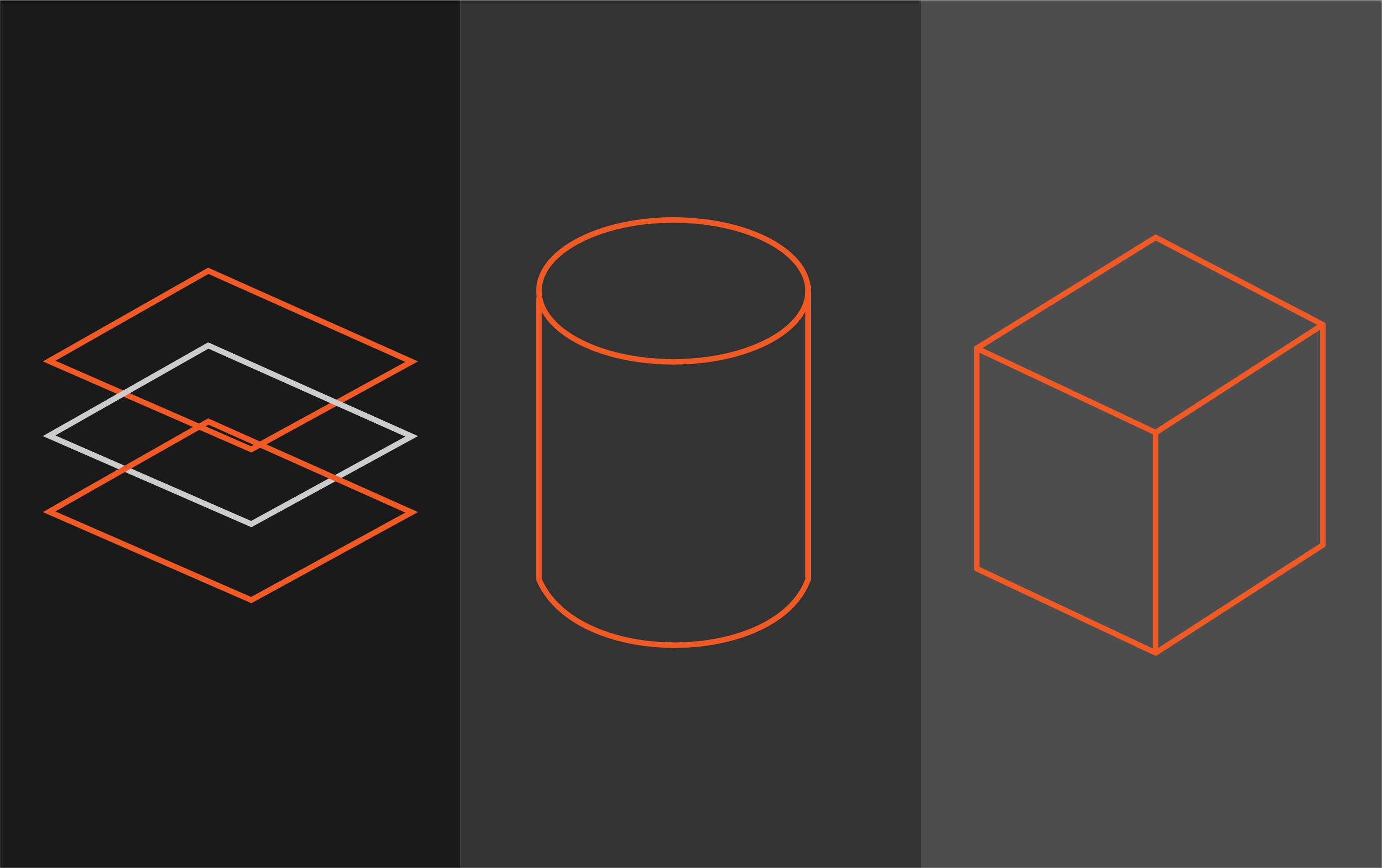
Each material object is measured using a unit known as device independent pixels, or dp’s. Material design uses dp’s to measure the height, width, and depth of material. Because digital material is considered “real” it lies on a 3-dimensional coordinate system with the X, Y, and Z axes. This allows layering to be done which creates a sense of depth in the digital world just like in the real world. Content, however, lies flat on the material.
2. Content Behaviour
When users interact with content they are also interacting with the material such as when tapping a video or swiping a button. The action should feel intuitive and at least faintly mimic the real world process. Material design helps achieve this purpose.
3. Interface Icons
User interface icons (we’re not talking about product icons/app icons here) are referred to as system icons in this design language. The idea is to create icons that can be instantly recognized at any size and are, most importantly, consistent. This, in design, translates essentially as very low detail and a solid colour.
4. Animation and Motion
Material design places a lot of emphasis on motion. That Google has an entire section dedicated to authentic motion stands testimony to this. It’s considered to be a response mechanism to user interaction which can often mimic reality. With material design, it’s possible to create motion with modal windows, sliding menus, buttons, and even icons.
When pushed, some objects glide faster than others. When pressed, some objects compress deeper than others. Once you go beyond such basic motion, you can also stretch, merge, divide, or regenerate material. What’s also of note is that material can move on any axis, typically based on user interaction.
The idea here is that material behaves like a digital surface ordered into a hierarchical structure and motion is used to demonstrate the relationship between a user’s interaction and how the material is readjusting itself.
Winding Up
With constantly evolving and quickly mounting user expectations for ever-better digital experiences, it makes perfect sense that the use of material design in web development is quickly gathering momentum.
In fact, material design is turning out to be one of the next big trends in web design that is here to stay.
If you are a web application development company, it’s about time you asked yourself: are we keeping up with it?


